

Pantone 2026 and color trends: palettes and ideas for interior design
02 marzo 2026
In 2026, color will once again become a “project”: less wow effect, more balance between light, material, and proportions. This change is particularly evident in surfaces, primarily porcelain stoneware floors and wall tiles, because they shape the perception of space, room after room. Pantone 2025 Mocha Mousse
What is Pantone Color 2026 and what does it represent?
The Pantone color symbol for 2026 is PANTONE 11-4201 Cloud Dancer. While the previous year was characterized by the enveloping warmth and earthy tones of Pantone 2025 Mocha Mousse, this new choice marks a shift towards an ethereal brightness: a soft, neutral shade of white that evokes the lightness of clouds. It is not optical white: it is bright, but warmer and less “direct” than pure white.
Cloud Dancer conveys calm, serenity, and clarity, becoming a versatile color base. Pantone describes it as a structural color, capable of enhancing other shades and functioning both as a background and as a contrasting element.
2026 Color trends in interior design
The need for calmer environments leads to controlled palettes and less aggressive contrasts. In Sherwin-Williams' Colormix Forecast 2026, there are four main directions: Foundational Neutrals, Sunbaked Hues, Restorative Darks, and Frosted Tints. Translated into “material” terms, these become practical guidelines: which finishes to choose, how much depth to give to the grain, and how to make light work on matte, lapped, or textured surfaces.
Four ready-to-use colour palettes
When selecting palettes, the colour must relate to materials, light and furnishings. Below are four combinations designed to transform the trends of 2026:
- Foundational Neutrals: warm whites, beiges, greiges and soft greys. Perfect with Cloud Dancer for minimalist, Japandi or elegant contemporary living rooms: continuity is key here, with light surfaces and almost invisible joints.
- Sunbaked Hues: sand, clay, desaturated terracotta. Ideal for Mediterranean homes and hospitality spaces: honey woods, natural fabrics, satin metals and ‘sunny’ stone-effect surfaces.
- Restorative Darks: deep greens, blue/greys and soft blacks. Darkness as comfort and depth, suitable for bathrooms and statement areas. In stoneware coverings, it is expressed with dark stones, marbles and cements.
- Frosted Tints: dusty blues, cool greens, smoky lavender. Excellent in workspaces and bedrooms: they make the environment more ‘silent’, especially when combined with micro-structured textures.
How to choose porcelain stoneware based on the colour palette: a quick guide
The choice of stoneware should be based on the colour palette, because the final effect depends not only on the colour, but also on how it is perceived on the surface, installation and light.
- Finishing (matt/honed/polished): matt diffuses and softens; honed adds depth and controlled reflections; polished amplifies light but requires a ‘cleaner’ design (visual order and minimalist furnishings).
- Size: large slabs increase continuity and the perception of spaciousness; smaller modules introduce rhythm and help to define functional areas.
- Grout and installation: on neutral colors, the grout is part of the palette. Shades and sizes must work by subtraction, not by contrast.
- Light: it is important to always evaluate samples at the point of use, with natural and artificial light, because whites and greys change significantly with colour temperature.
How to use Pantone 2026 in your home (room by room)
Pantone 2026 Cloud Dancer easily adapts to any environment and naturally shapes stoneware floors and wall tiles. We move from the living area to the kitchen, bathroom and bedroom to understand how light, materials and surfaces can create consistent atmospheres.
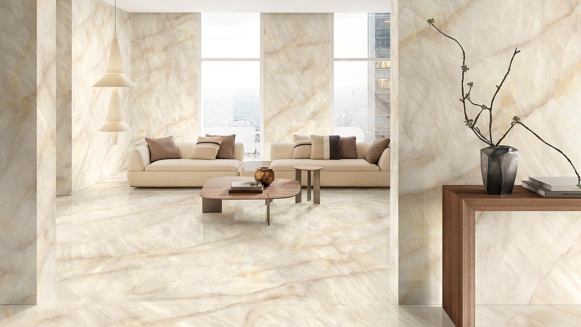
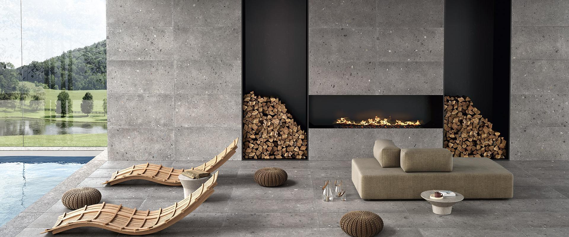
Light-coloured porcelain stoneware tiles for living areas and kitchens
In living areas and kitchens, the priority is to create visual continuity without sacrificing warmth and character. Cloud Dancer and neutral colours work best when they become matter: light-coloured, slightly textured surfaces that can accompany different styles and remain contemporary over time.
Collections such as Pietra di Orosei and Pietra Essenza fit well into this scenario.
Pietra di Orosei by Provenza evokes a Mediterranean feel with its bright, warm shades, ideal for welcoming environments, where the surface adds depth without weighing down the space.
Pietra Essenza by Emilceramica, on the other hand, interprets neutral tones in a contemporary key: a refined balance between sobriety and visual richness, in which the stone effect dialogues with wood, natural fabrics and satin-finish metals.
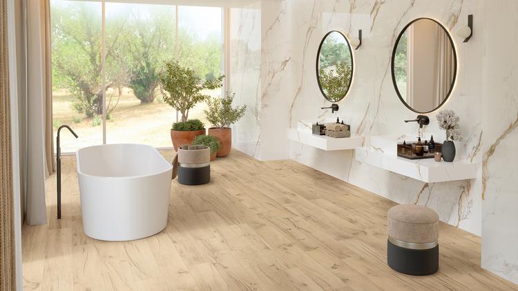
Pantone 2026 tiles in the bathroom and bedroom
The bathroom and bedroom require a more intimate setting, where every colour choice must promote calm, order and a sense of comfort. In these rooms, Cloud Dancer is the ideal base: it brightens without being ‘cold’, softens contrasts and allows you to control the atmosphere even with warm artificial lighting.
To enhance this setting, Tele di Marmo Crystal by Emilceramica is particularly suitable. Inspired by light marble and enriched by a “crystal” interpretation, it amplifies light and introduces a discreet but recognisable elegance. In the bathroom, it helps to define orderly and sophisticated surfaces; in the bedroom, it can become a measured, dramatic accent, capable of giving identity to the space without compromising the feeling of relaxation.
Whatever solution you choose, Emilgroup offers a wide selection of porcelain stoneware tiles to choose from, perfect for every need!
Collections used in the project


Any Questions?
If you are looking for the ideal covering for your home or business or you have any questions about our collections, don’t hesitate to get in touch! Together we’ll find your perfect bespoke solution!
If you are looking for the ideal covering for your home or business or you have any questions about our collections, don’t hesitate to get in touch! Together we’ll find your perfect bespoke solution!
Enter the Emilgroup world!
Stay up to date with the latest news from the world of ceramics. Find out about our new collections, events and innovative applications of porcelain stoneware.